Toolkit
06.
Application
Our story
At its core, our motion should be simple and smooth. Animation is usually moving from left to right, giving a sense of progress.
Do and don’ts
Lower thirds should run across the screen (mimicking a thread). They should animate in from left to right.
Chapters or cutaways should be consistent and branded. Illustrative devices can be used to house logos for example.
Use this as an intro our outro to brand our videos - unless it becomes unnecessary because you have a specific CTA or event title.
Use the behaviour of real-life counterparts to inform your animation. Use Principles like anticipation, overshoot and ease.
Do and don’ts
Use this general template when using content that doesn't warrant it's own art work.
Use mockups in front of branded backgrounds for depth. These are especially useful when the topic relates to mobile platforms which can be shown on phones.

Use our illustration set sparingly, preferably for key promotions that stand out from our regular communications.

Use stats and information in single bursts that will capture attention. It's better to focus on one thing at a time and give our posts more space, rather than trying to cram in too much information.
Use full bleed imagery as background for variation as long as they fit in with our photography style. We can use elements of the gradients blended on top to help house text and improve visibility if needed.

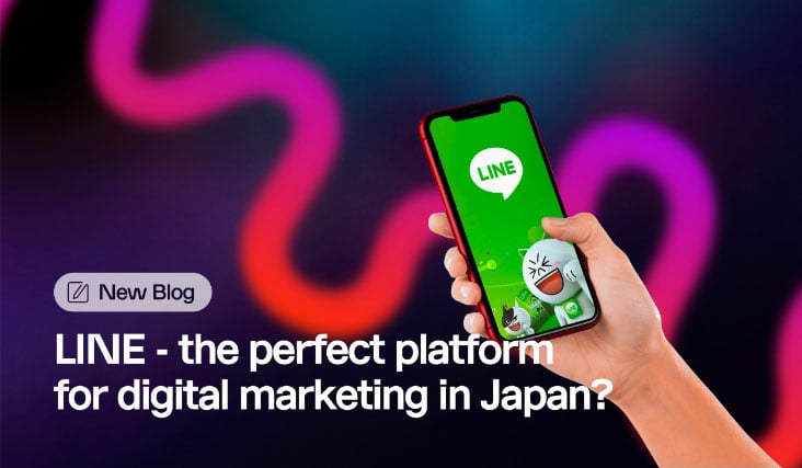
Patterns and our simple icons set simple can be used to create clear layouts without clutter. Use lozenges to label post types e.g. 'New Blog' as we've shown here.
Make use our alternative character set if possible for important posts which can help grab attention. We can use all capital letters, but just avoid it for longer headlines or sentences.
Do and don’ts
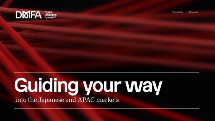
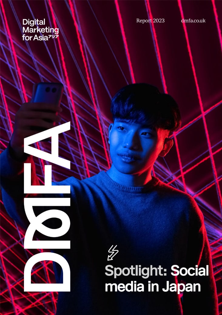
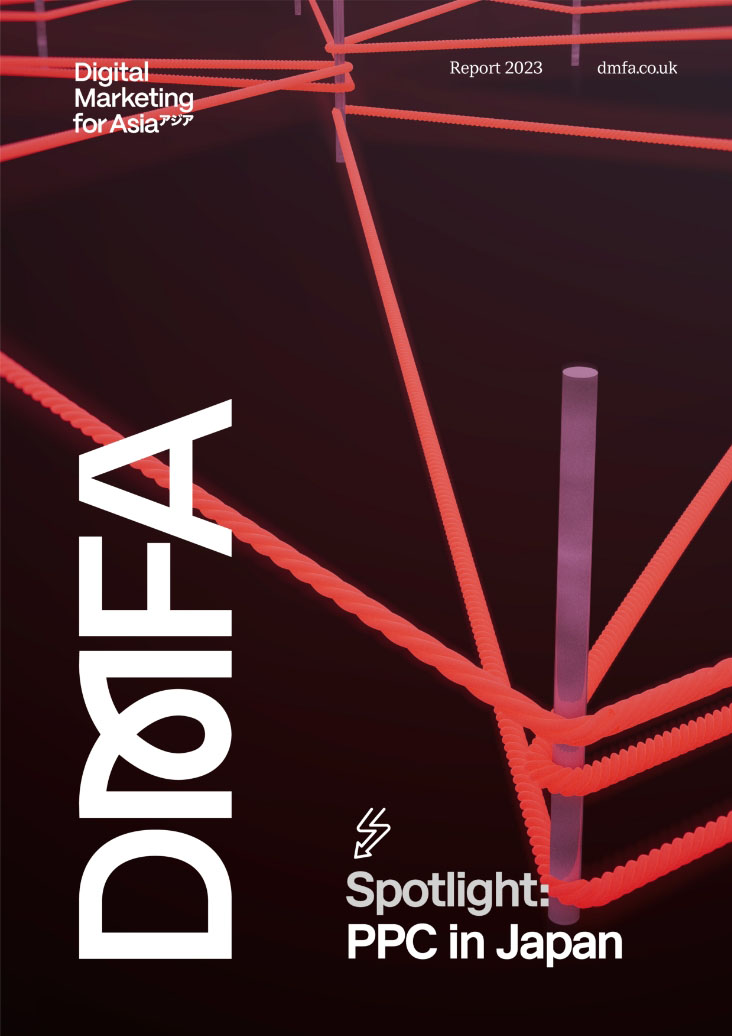
Our thread renders should be used on covers, we can create flexibility by using different crops and angles.
Slides can be divided in grids, often half half or two third approaches can look effective.
Usually one supporting image is enough – there’s no need to include multiple images on a single slide as this muddles your message.
Don’t be afraid to use really big stats to grab attention, sometimes this can be more effective than lots of stats on the same page.
Breaker slides can be more colourful, as this provides clear definition from the darker slides used to present information.
Use mockups if we’re showing mobiles or tablets, bleed them off the page to create visual interest.
Keep text to a minimum, white space is key to our brand visuals. If using more text, it tends to look better presented in columns.
Styling


Do and don’ts

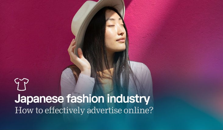
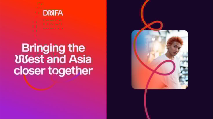
Thread illustrations can be used to house imagery, try and make sure facial features aren’t cut off if using people.
Full bleed photography can be used, whilst we can use illustrated elements to work alongside it for distinction.
We can use cut out imagery and place it over distinctive background that relate to our brand, making sure lighting is complimentary.
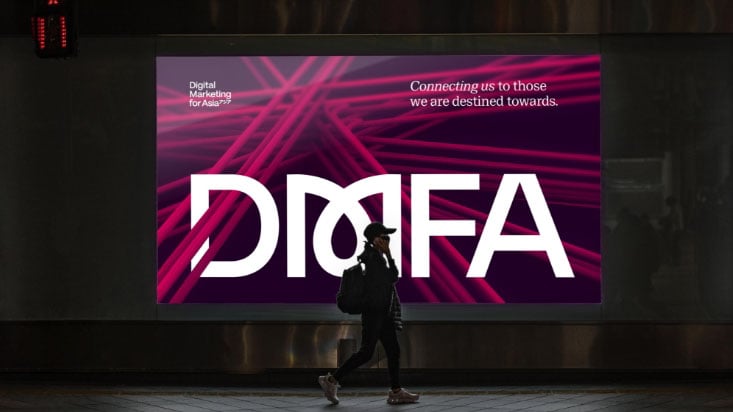
Our thread renders can be used as background imagery and provide interesting compositions to break up content.
Do and don’ts
Larger formats can provide an opportunity to celebrate our logo at scale. Thread renders provide a distinctive backdrop.
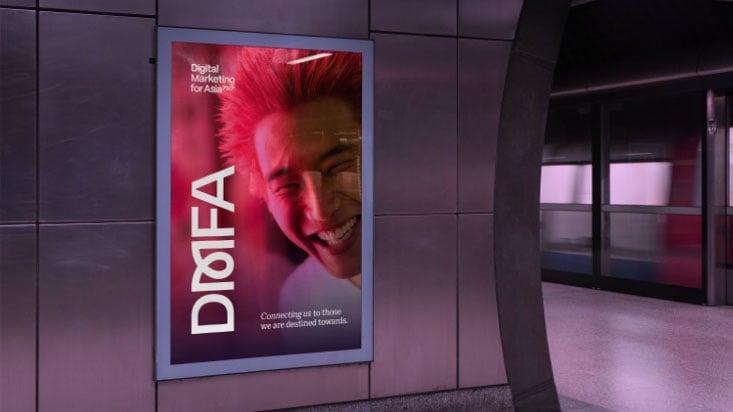
If we use photography, try and make sure to lean on elements of our colour palette through lighting for example.
Do and don’ts
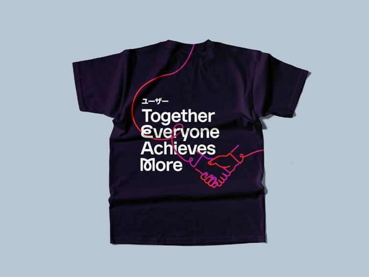
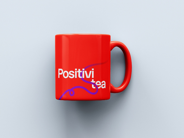
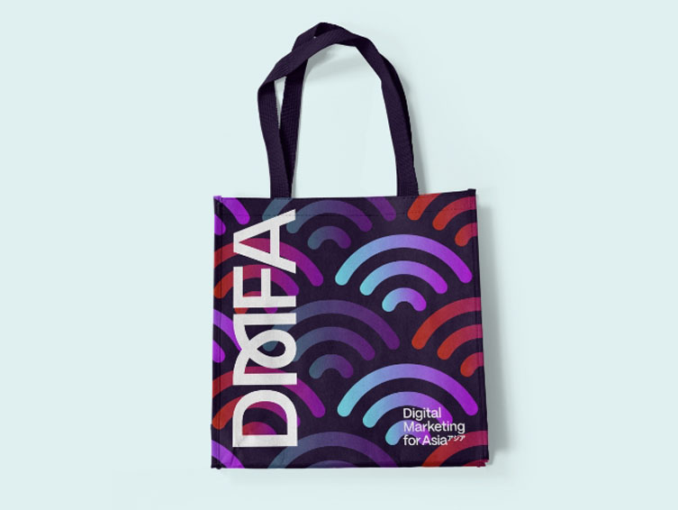
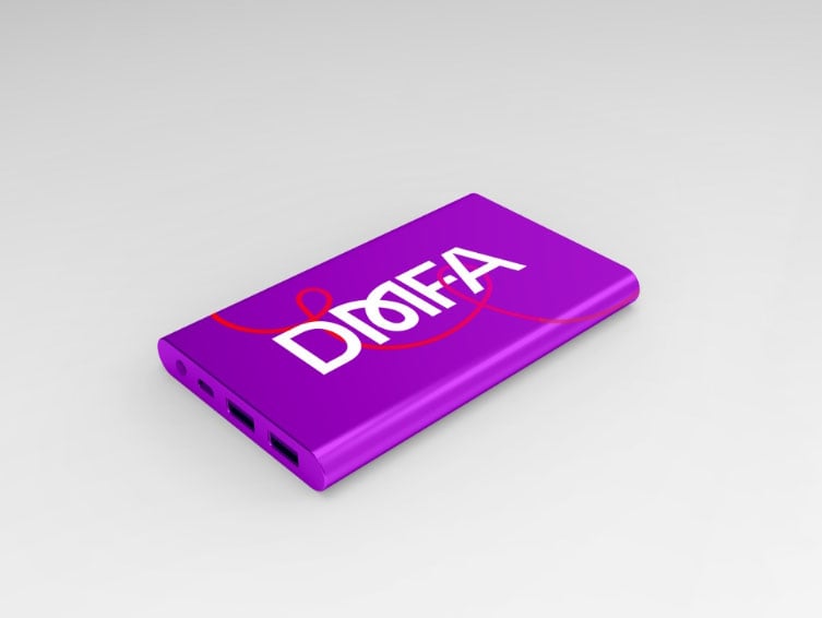
Useful objects that are long lasting, preferably produced from sustainable or recycled materials.
Landfill plastic and other cheap materials.
These items should tell a story or raise a smile, whilst using key elements of our brand such as illustration and typography.
Colours that aren’t on brand.
Do and don’ts
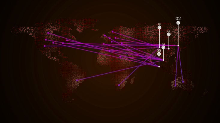
Use linear graphics that relate back to our red thread concept.
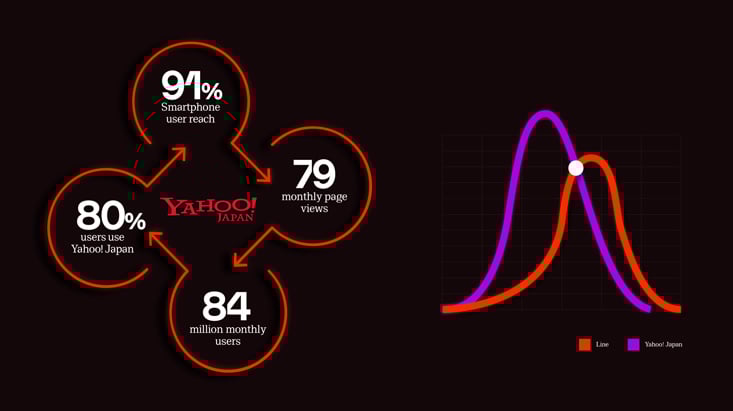
Use a slight and subtle outer glow effect to enhance the look of infographics.