Toolkit
01.
Logo

Variations
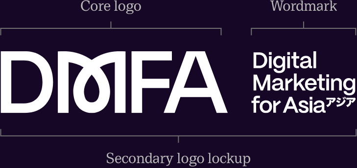
Our Core logo is confident and bold, but remains approachable and friendly. It incorporates a looped ‘M’ which derives from our story of Akai Ito, with the thread and loop relationships we hold with our clients and partners. Our Wordmark logo compliments this and spells out our full name where needed. It can sit next to the main Core logo if needed but we prefer to give it some distance.

Core logo
This mark is ready to use on any external-facing communication and is our primary option.
Small Avatar/Favicon/App
Where we are restricted to a very small space we can use our distinct looped ‘M’ from the Core logo in isolation.

Wordmark logo
This secondary mark can be used to support our Core logo.
Secondary lockup
The secondary logo lockup is made up of our Core logo and Wordmark. We would usually reserve this for use on 3rd party communications, particularly where the intended recipient audience may not be familiar with our brand.

Do and don’ts
Oversize the logo. It works well at large and small scales, so sometimes bigger is better!
Allow enough space around the logo. It should always have some room to breathe.
Rotate the logo 180 degrees if you wish, it is distinctive enough to work both ways.
We can overlap with the logo with parts of our 3d threads or illustrations, as long as it remains readable.
Don’t use our logo as a typographical substitute or word component.
Don’t add drop shadows or effects, stretch or distort the logo.