Toolkit
Logos
Logo
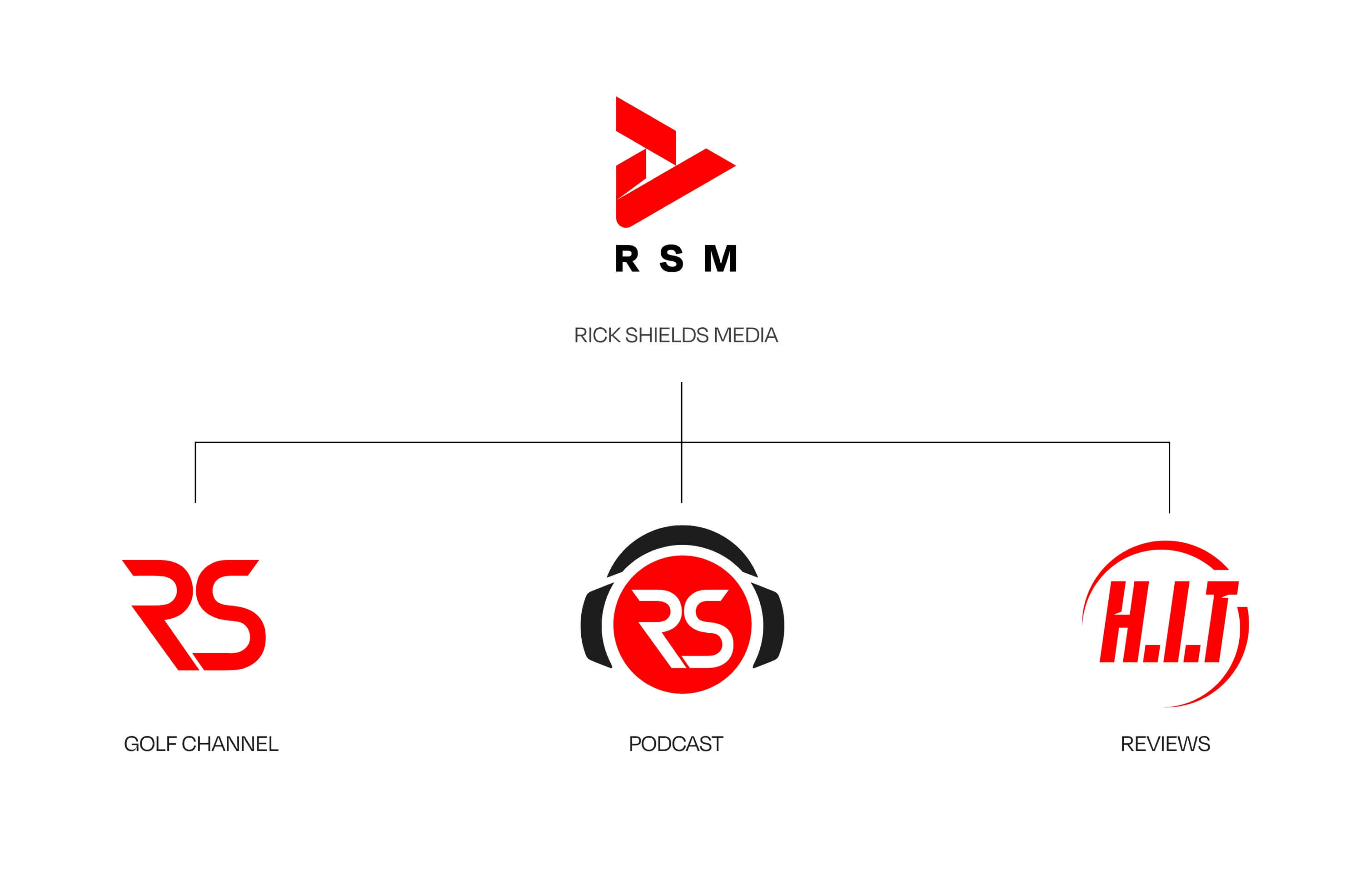
Brand Architecture
In our endorsed brand architecture, our RSM parent brand owns the sub-brands but they have more individuality and flexibility as they have a greater presence in the market.
Logo
RSM Core Logo
Our Core logo originates from our Purpose, opening up the game to all and encouraging play. With Rick’s content originating as video we also incorporated a play symbol within the logo mark. The whole construction is from tessellated play symbols, whilst the overall energy and movement is inspired by the pace and power of a golf swing. The nick in the mark resonates with our bespoke typography and originates from the shadow cast by the pin on a green. It also adds dynamism and a sense of direction, values we hold as part our brand.
Core logo
This mark is for use on any RSM B2B external-facing communication such as letterheads, presentation decks and emails, plus any internal communication we use such as policy documents, reports and plans.
DownloadCore logo with wordmark
Our core logo can also be used with our RSM word mark. We should use this logo in spaces where it may not be associated with our own branded content eg. sponsorships or partnerships.
DownloadLogo
Colourways
We should always look to apply consistency in how the logo and its colour is presented. To build equity in this colour we encourage the use of red whenever possible. We may use red in the logo, or in the background if greater impact is required.


Logo
Partners
In horizontal configurations try and balance out the logos visually so one doesn’t dominate the other. Use a thin divider line to separate where needed.
Logo
Placement
These guides illustrate the appropriate sizing and positioning when used on some typical communication examples.
Examples
1. Adshel 2. Slide cover 3. Billboard
Logo
Golf Channel
Our RS initialled logo draws on a historical familiarity with Rick and his content output.
Golf Channel Logo
This logo should appear on any physical or digital assets that relate to our golf channel. When we talk to our audience of watchers, subscribers and fans this logo retains an existing level of brand equity.
DownloadLogo
Colourways
We should always look to apply consistency in how the logo and its colour is presented. To build equity in this colour we encourage the use of red whenever possible. We may use red in the logo, or in the background if greater impact is required.
Logo
Circular
These are the circular versions and scales of the logo.
Logo
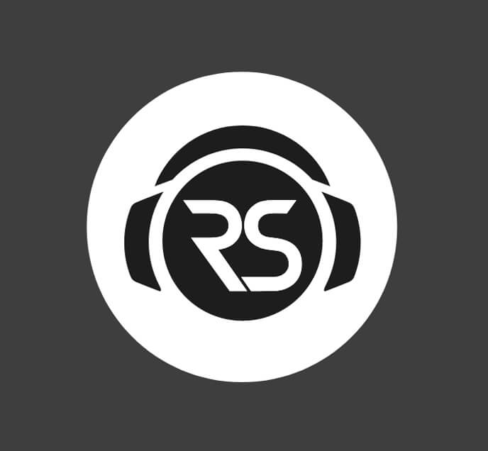
Podcast
On our Podcast, our RS initialled logo is housed within a headphone device.
Podcast Logo
This logo should appear on any physical or digital assets that relate to ourpodcast. When we talk to our audience of watchers, subscribers and fans this logo retains an existing level of brand equity.
DownloadLogo
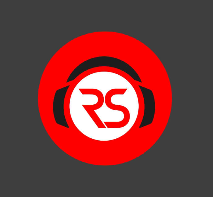
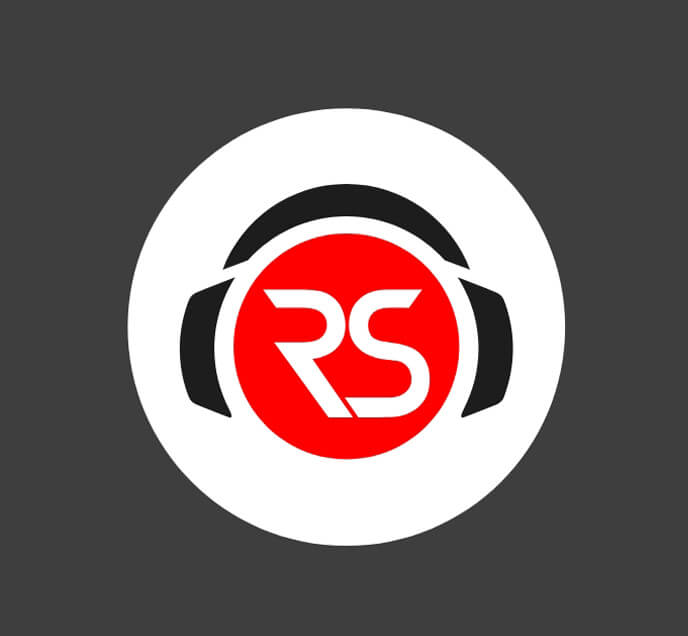
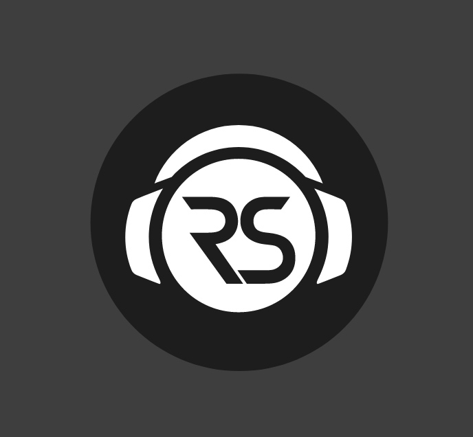
Colourways
We should always look to apply consistency in how the logo and its colour is presented. To build equity in this colour we encourage the use of red whenever possible. We may use red in the logo, or in the background if greater impact is required.
Logo
Circular
These are the circular versions and scales of the logo.
Logo
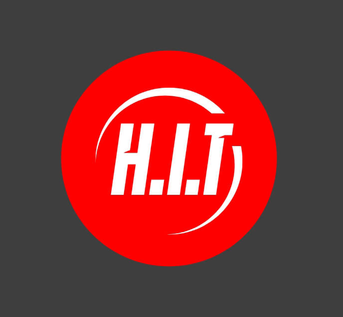
Reviews
Our HIT logo should be used for our review channel only.
Reviews Logo
This logo should appear on any physical or digital assets that relate to our reviews.
DownloadLogo
Colourways
We should always look to apply consistency in how the logo and its colour is presented. To build equity in this colour we encourage the use of red whenever possible. We may use red in the logo, or in the background if greater impact is required.
Logo
Circular
These are the circular versions and scales of the logo.


Logo
Do and Don'ts
Allow enough space around our logos. They should always have some room to breathe.
Make sure to use the right logo for the appropriate channel and audience.
Don’t retype the logotypes in a different font, use the version embedded in the logo.
Don’t cram logos into a small space or crowd it with other logos or elements.
Don’t use any other colours outside of our primary colour palette.
Don’t add drop shadows., effects, stretch or distort the logo.