Toolkit
Typography
Typography
Type stack
We predominantly use these 4 colours on the bulk of our communication. Repeated and consistent use of these colours helps to build familiarity and ultimately trust for the brand. Red represents the power and passion we have for the game. Carbon Black and Aluminium Grey represent the technical aspect of the game whilst White the traditional colour for a golf ball adds highlights and light.

Headlines, Numbers
This typeface is for headlines. We tend to use the Bold weight to create a statement.
We usually use this font in ALL CAPS.

Subheaders, Body Copy
This typeface is for reading supporting copy, or longer form. We tend to use the regular weight. It can be used in ALL CAPS for smaller ‘eyebrow’ statements if needed.

Key words, Numbers
Avoid using this for sentences, rather keywords or numbers alongside our headline font.
DownloadTypography
Alternative
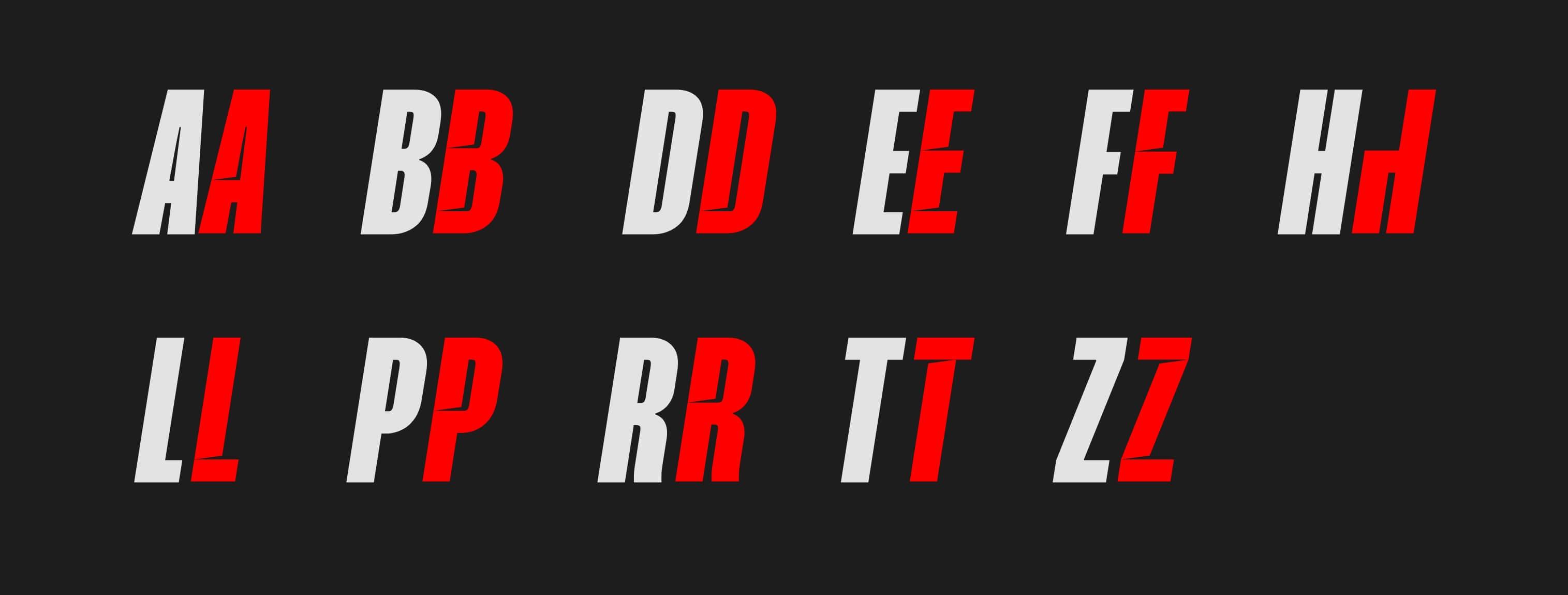
Characters
Our Mango Grotesque typeface has a bespoke character set developed for our brand. We use this to add extra distinction and dynamism to our communication. Follow the appropriate link to see how to add these in the following software:
Adobe Illustrator
Adobe Indesign
Adobe Photoshop
Canva
Microsoft Word
Typography
Common
Pairings
These typographic scales help to show the relationship between our typefaces. Maintain hierarchy through scale—It is important to maintain type hierarchy. This allows for clarity, consistency, and a strong balance for all communications.


Typography
Colour Usage
#FF1400
CMYK: 0, 98, 100, 0
RGB: 255, 20, 0
Headlines, Subheaders
#FFFFFF
CMYK: 0, 0, 0 ,0
RGB: 255, 255, 255
Headlines, Subheaders, Body copy
#1D1D1D
CMYK: 72, 66, 65, 76
RGB: 29, 29, 29
Headlines, Subheaders, Body copy
#3E3E3E
CMYK: 68, 61, 60, 49
RGB: 62, 62, 62
Subheaders, Body copy
Typography
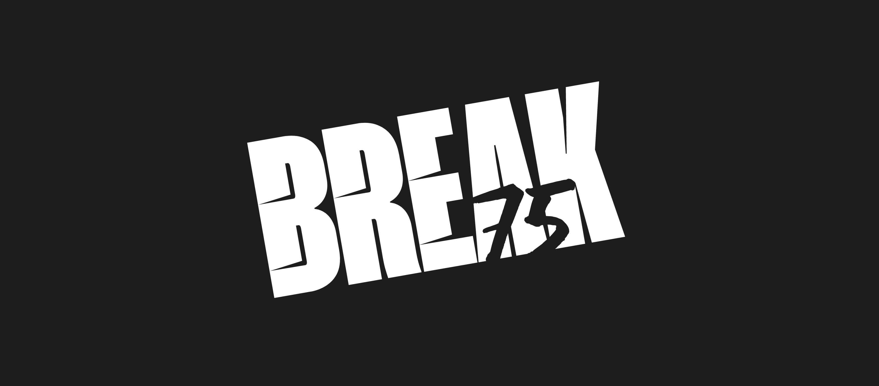
Text Effects
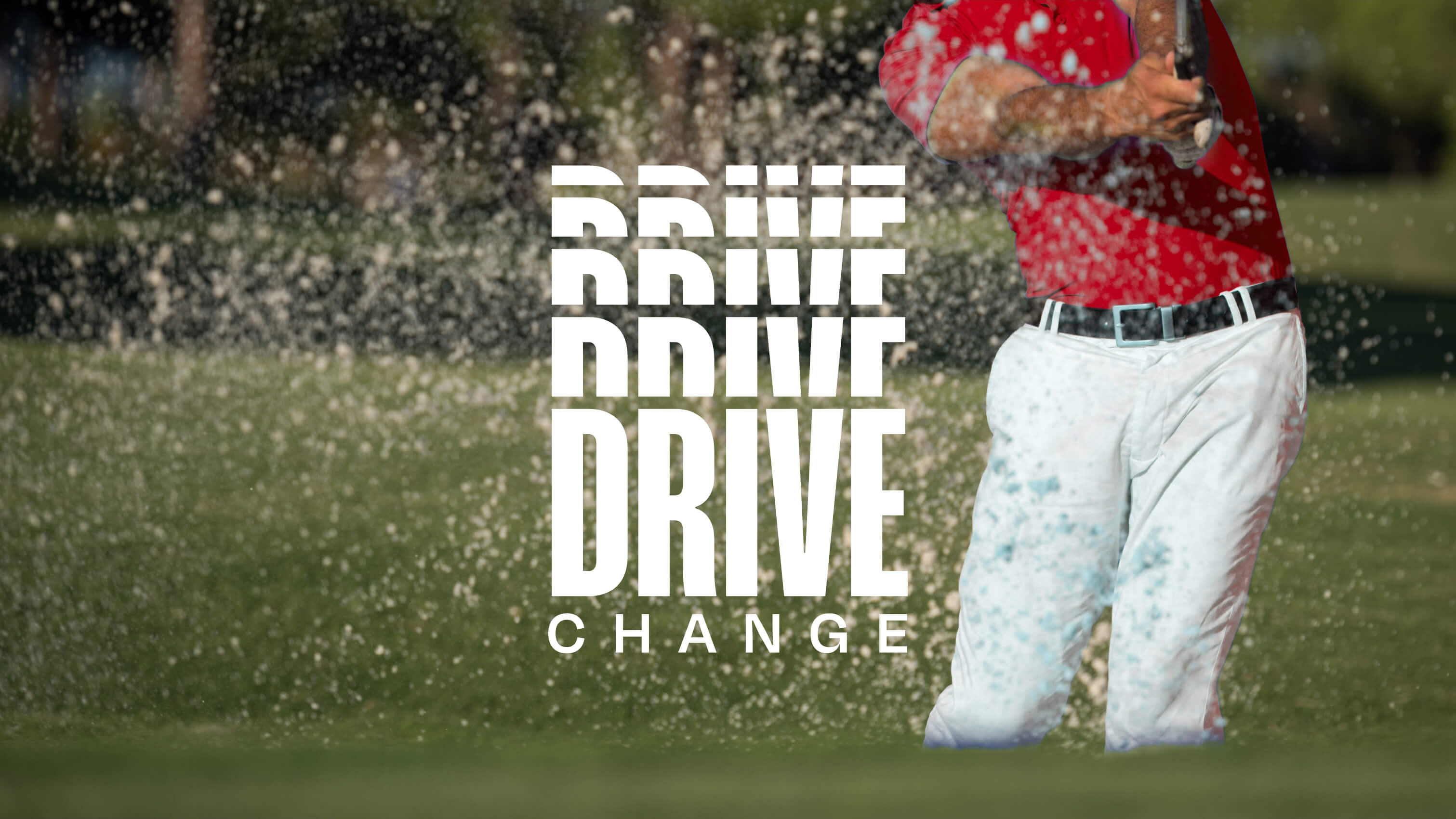
We can use a range of text effects to create further movement and dynamism within our communication. These examples demonstrate how they can be applied in a flat space, there are further moving examples in our Motion section.
Logo
Do and Don'ts
Consider relationships, the size, weight and placement effects the emphasis on copy.
Type size and layout should align with and support messaging.
Aim for contrast. Type over image and colour should be bold and clear to read.