As part of our 10 year anniversary, we’ve been exploring ways to celebrate the team’s creativity. We’ve recently refurbed our studio, and rather than use generic prints on the wall, we wanted to use the opportunity to bring own personalities into the space. Part of our company Vision is to celebrate hand made craft, so risograph printing seemed like a great choice that would allow us to embrace those little surprises and imperfections. We teamed up with the wonderful Caterpillar Press, who were on hand to guide us through the process.
Alice’s print: The story behind it
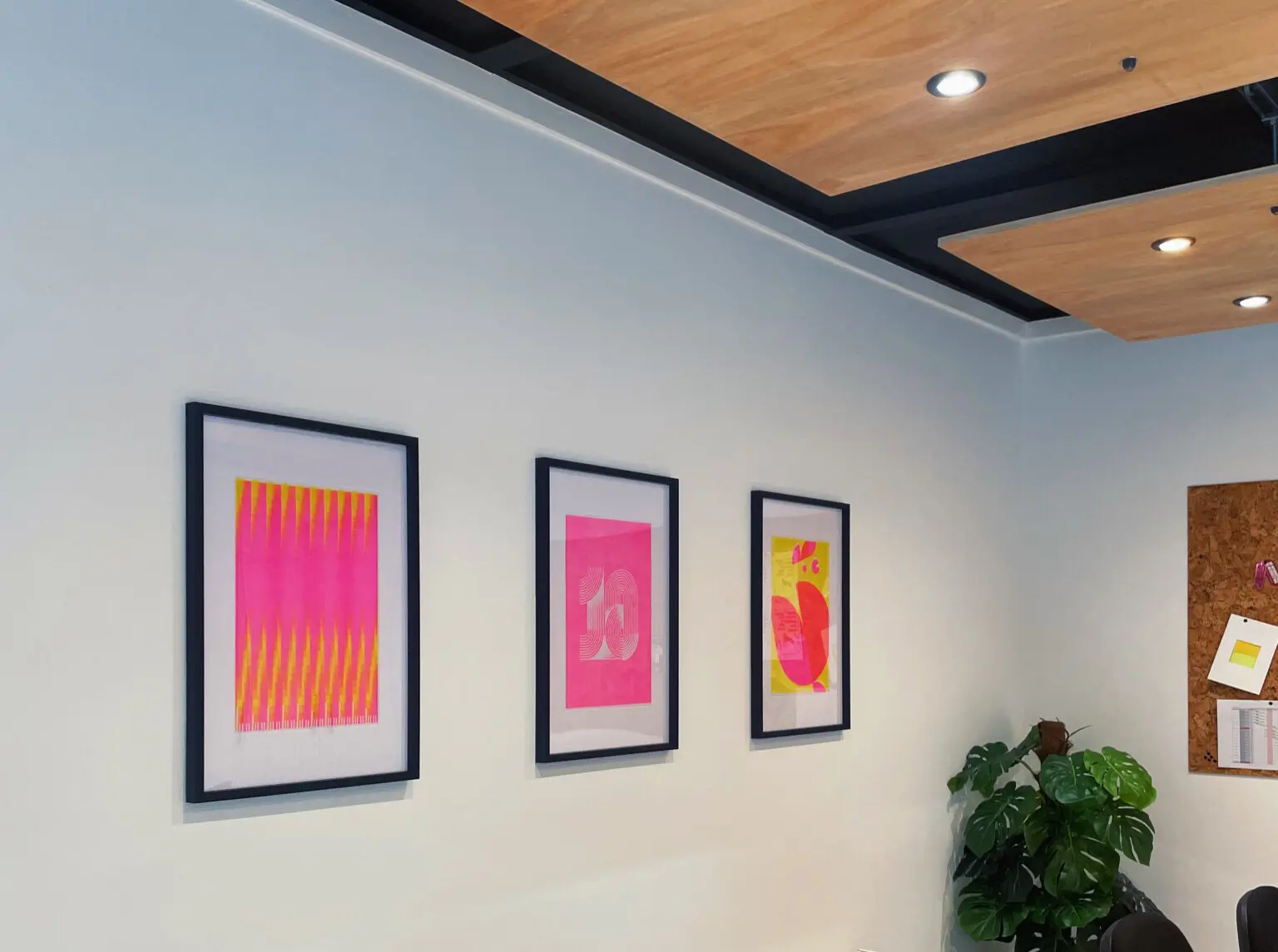
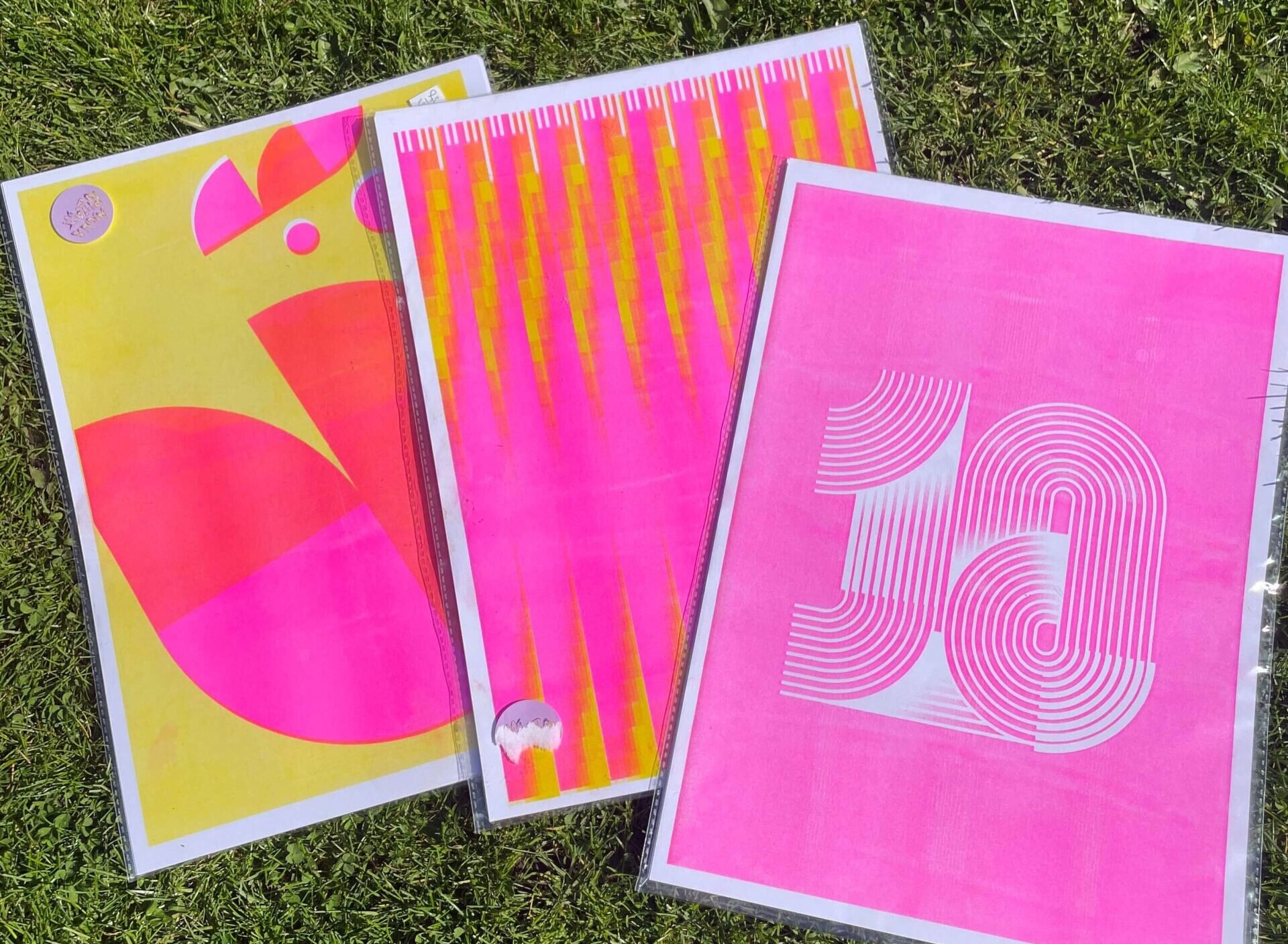
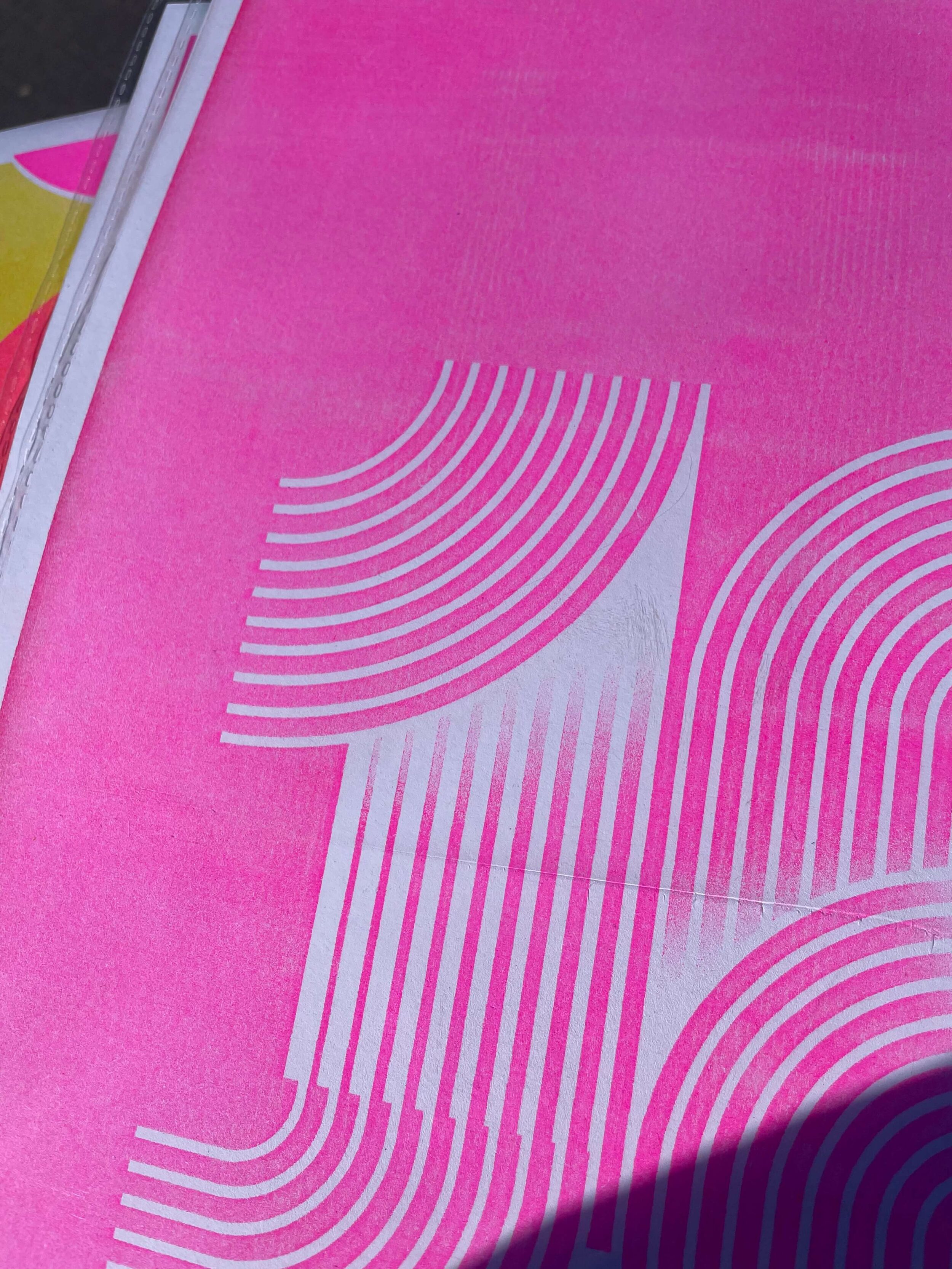
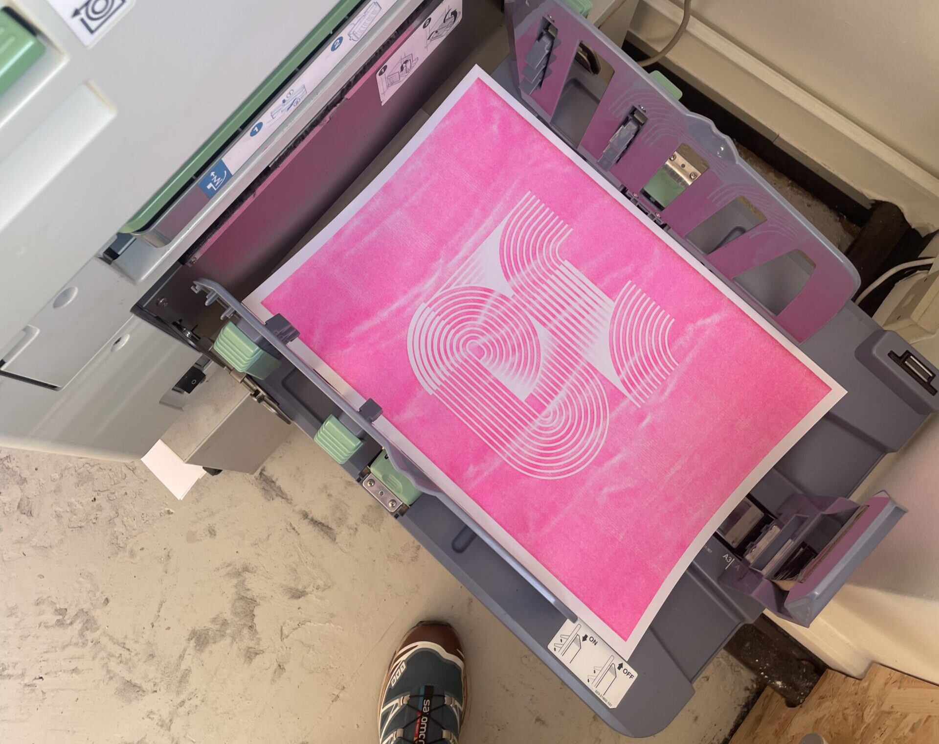
My typographic 10 print was a subtle nod to the Dawn branding. Our logo uses similar shapes, so I wanted to keep that same energy running through. And with it being our 10 year anniversary, it felt fitting to build each number from 10 lines as a little extra touch.
We went with risograph printing to add some colour to the studio and bring a bit of life to the space. It also helped tie the three designs together, even though each one’s totally different without losing their individual feel. Plus, it was just really nice to get in the workshop and be properly hands-on with the process!
Oli’s print: How he chose his design
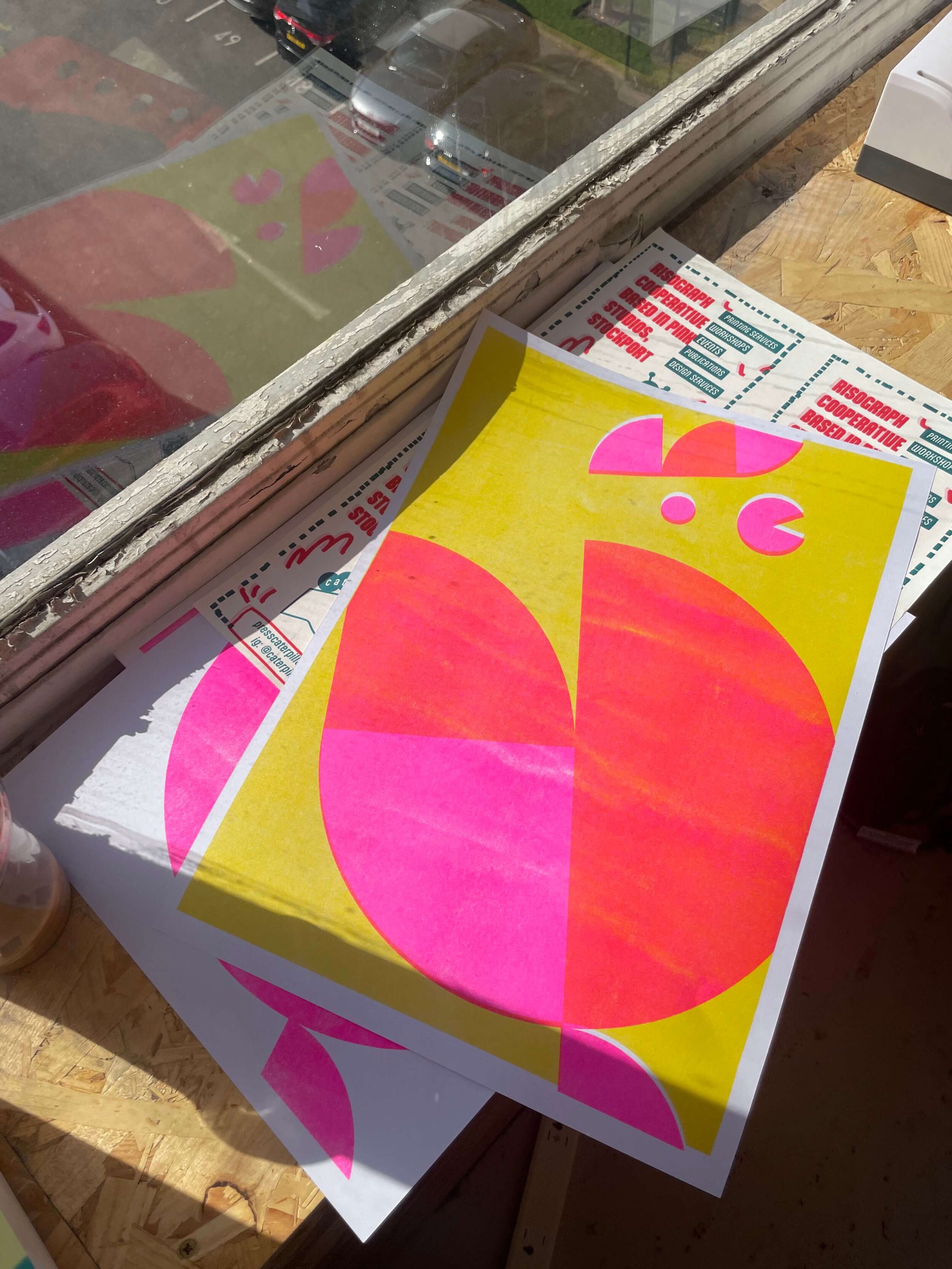
I knew I wanted to do something slightly surprising that might raise a smile. I often lead with words and language to trigger ideas, and so the hen was born. The hen linking to the number 10 originally comes from the Buckle My Shoe nursery rhyme which helps kids to learn to count, and it’s also ended up finding its way into cockney rhyming slang and a bingo call as shorthand for the number. Roosters are obviously notorious for crowing at the crack of dawn, so it all seemed to fit.
The illustration is made up of ten parts all formed from a circle, and harks back to an older Dawn visual identity where we used to construct illustrations from our half circle logo. It’s tilted at 18 degrees which is the position of sun on the horizon at Dawn when objects start to become visible – that’s something we’ve used to construct our creative process at Dawn for a long time now.
Also worth mentioning our team loves to point out I eat eggs every day at work, so it’s a nice reminder for me to have my breakfast!
Henry’s print: Inspired by lunar calendars
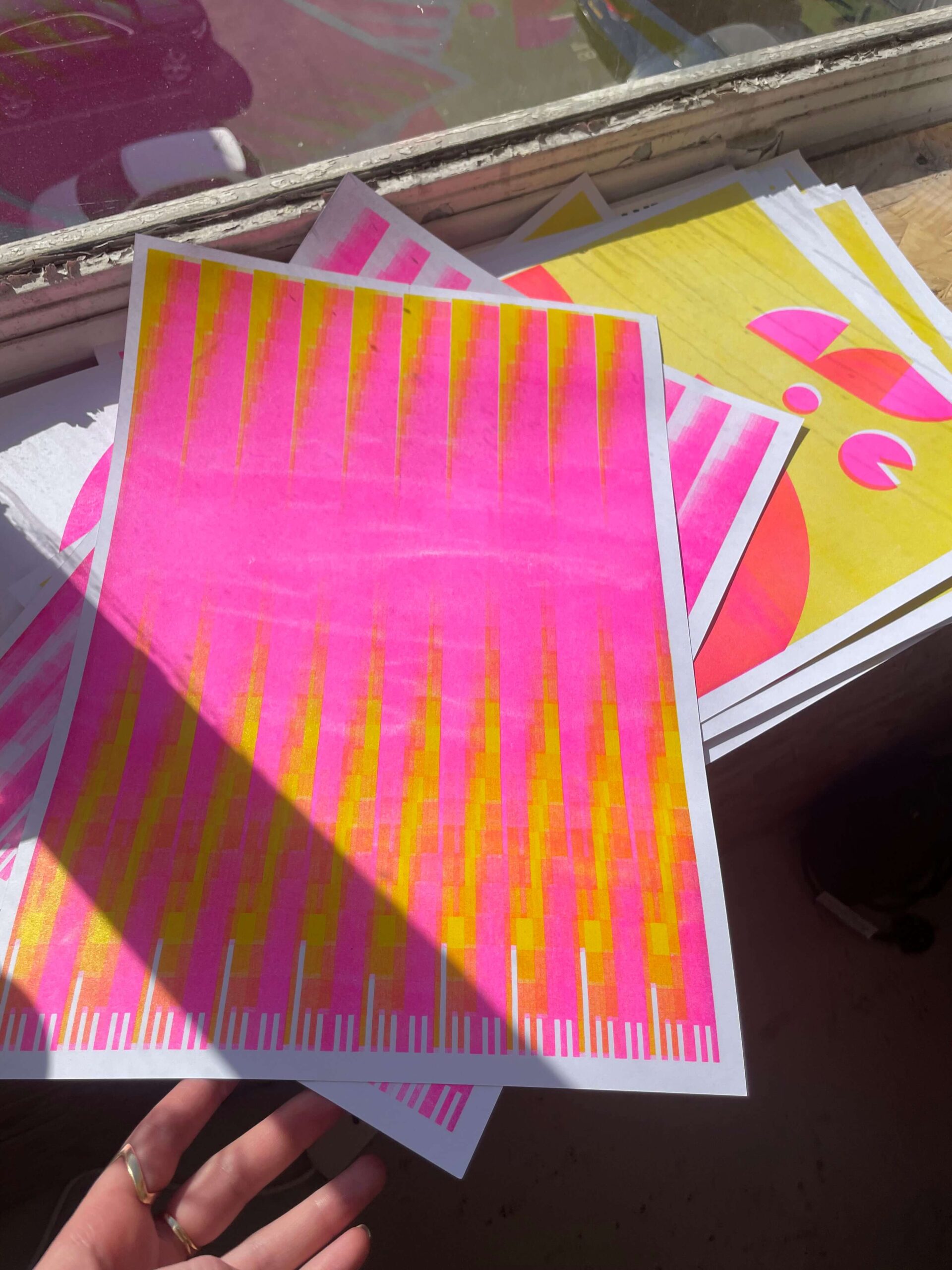
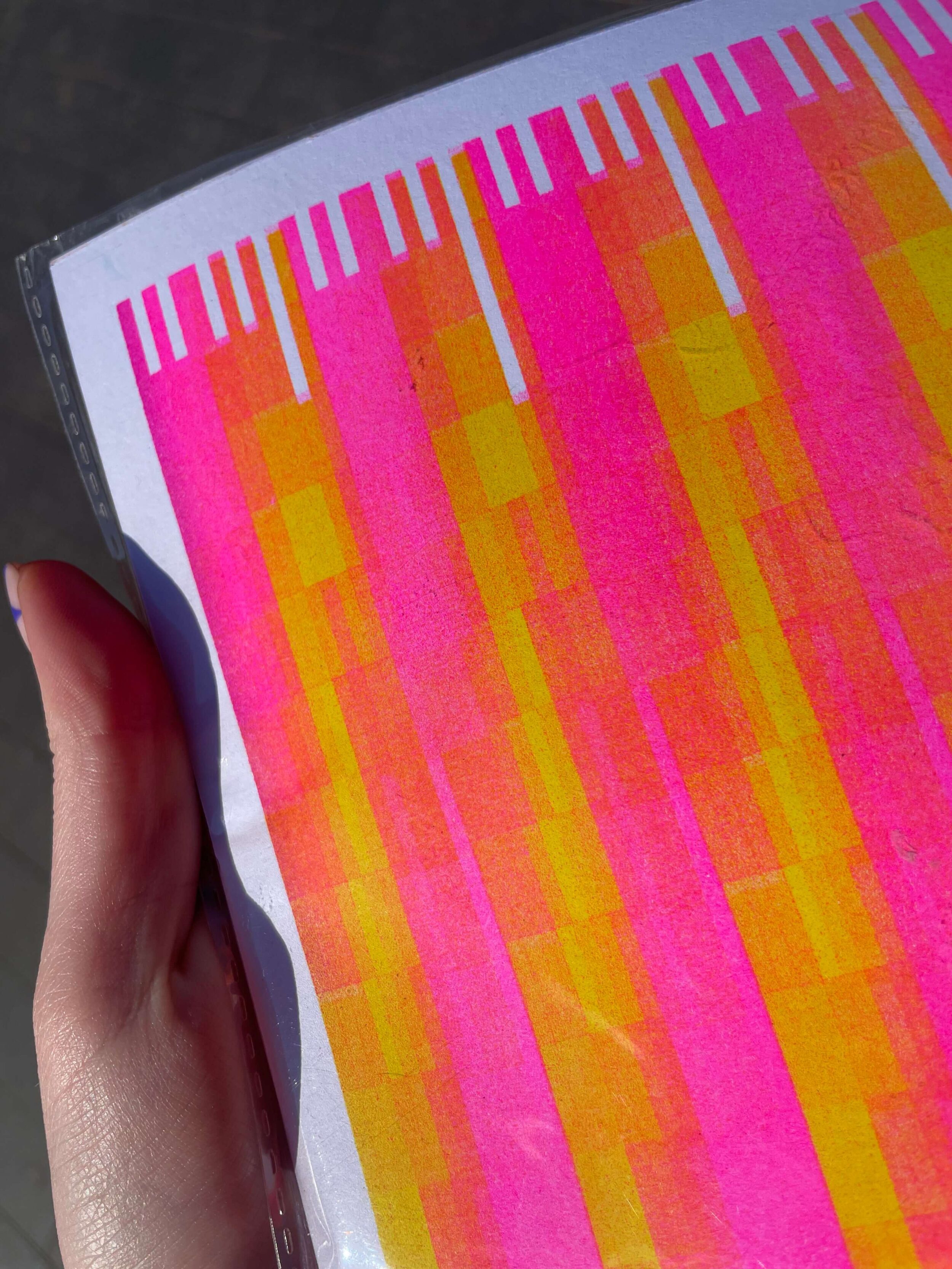
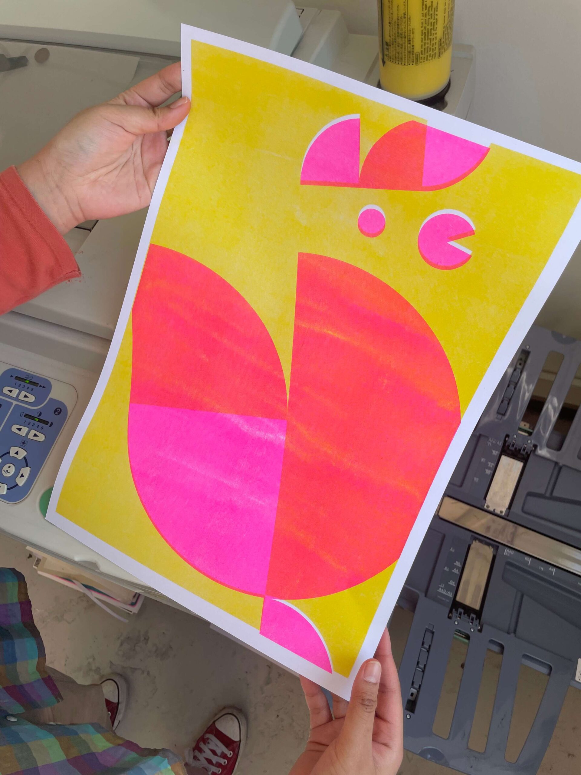
Using lunar calendars from the past decade, I created a tonal bitmap that forms a diagonal pattern, echoing the 18 degree angle of the Dawn logo marque. Printed on a riso machine, pink and yellow inks layer together to create subtle blends of orange, building soft, sunrise-like gradients.