Mortimer Childe

01
Services
Wake-up
Mortimer Childe is a contractor payroll partner delivering a range of PAYE umbrella services. While their offering already provided trust, clarity and peace of mind, the brand lacked the distinctiveness, confidence and personality needed to stand out and connect with prospective customers.
Through a series of workshops and stakeholder sessions, we uncovered the essence of the business: a company built on transparency, problem-solving, and doing exactly what they say they will. From this, a clear purpose emerged; to give people the freedom to do what they do best, supported by values grounded in trust, clarity and agility.
Using a psychology-based archetype framework, we defined a brand personality that is practical, friendly, efficient and reliably by your side. This gave Mortimer Childe a structured way to embrace its warmth, speed and subtly playful nature.
Competitive research confirmed a clear gap: many brands in the sector feel serious, safe and interchangeable. Mortimer Childe had an opportunity to stand apart by being more human, memorable and character-led — without compromising credibility or professionalism.
02
Rise
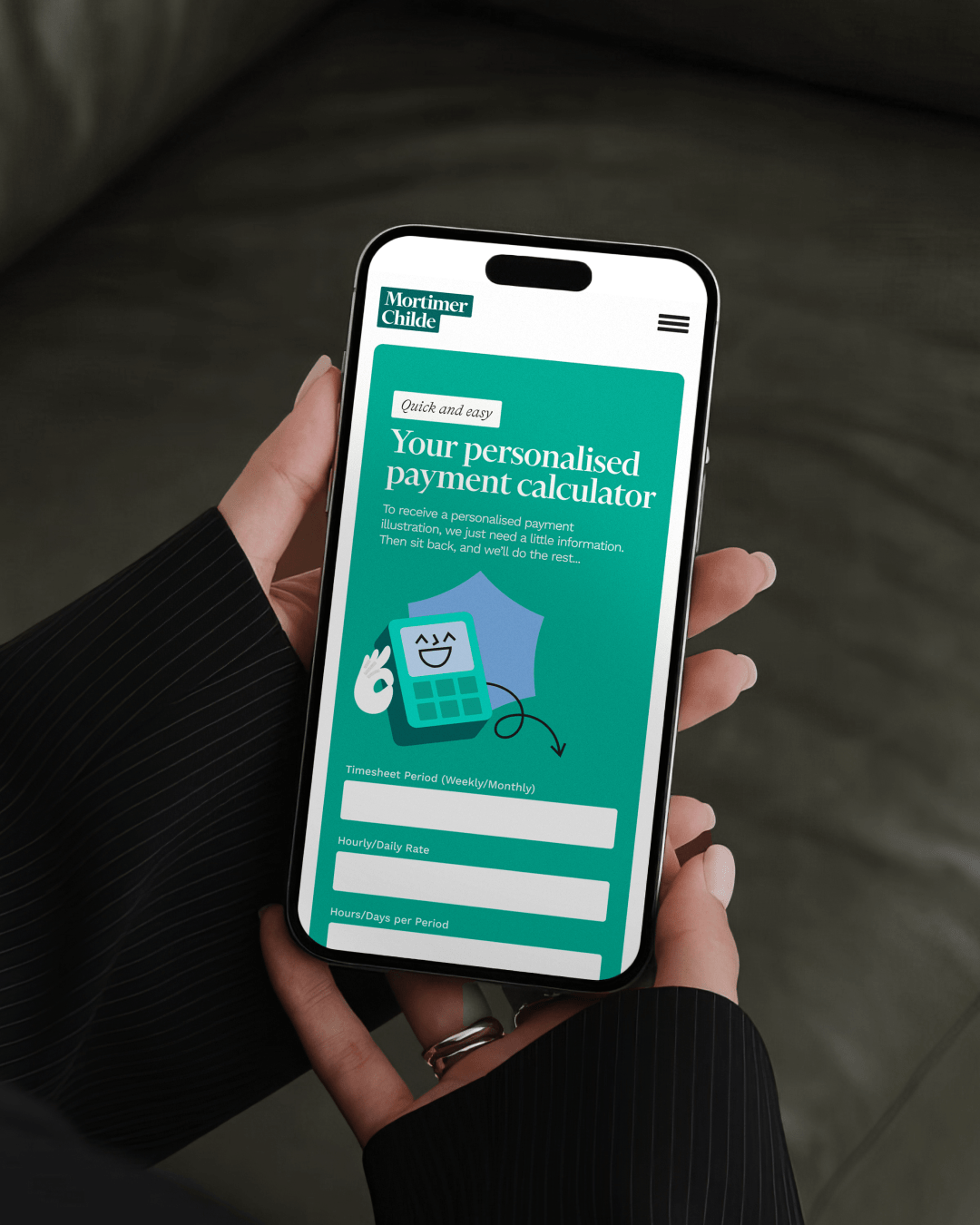
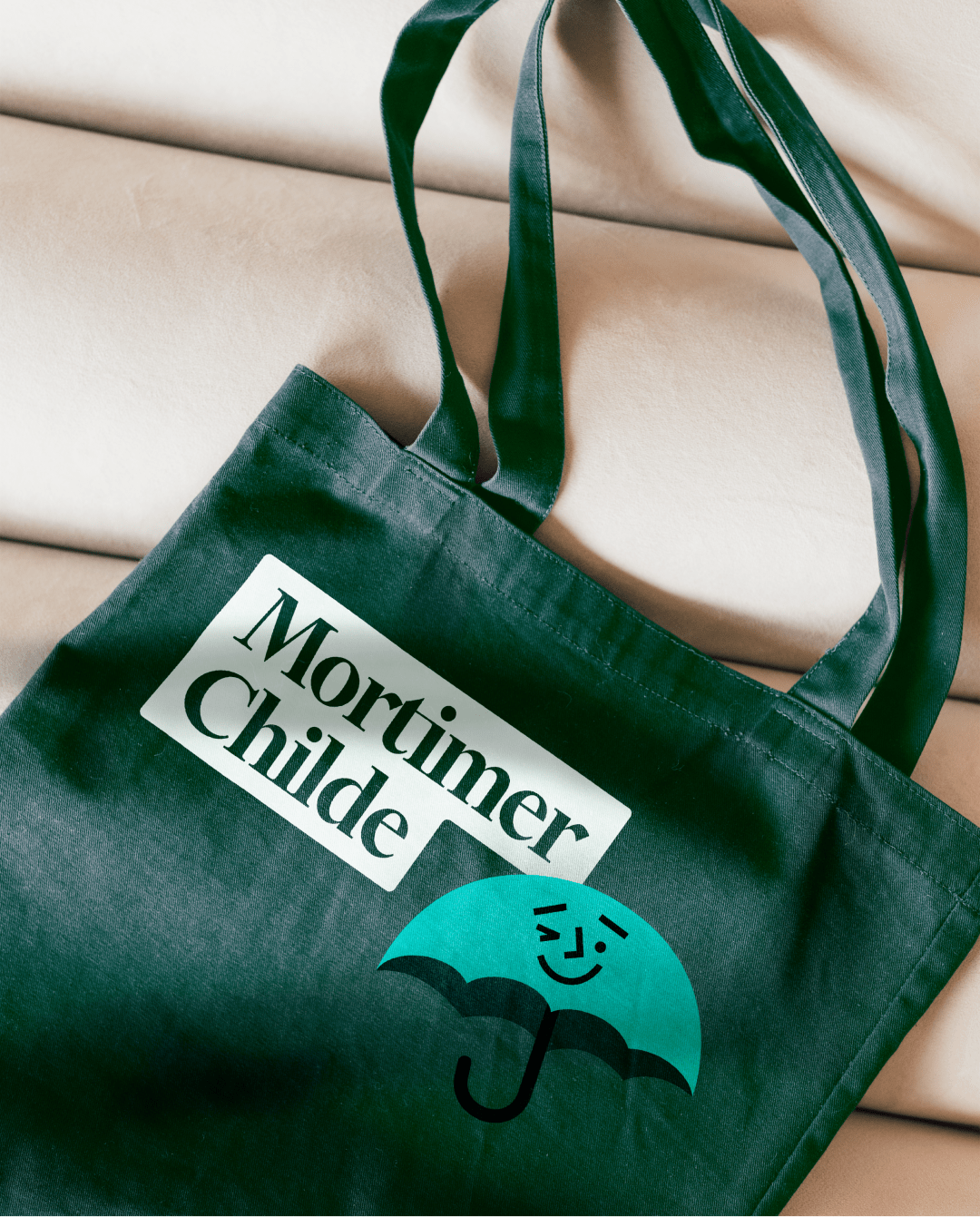
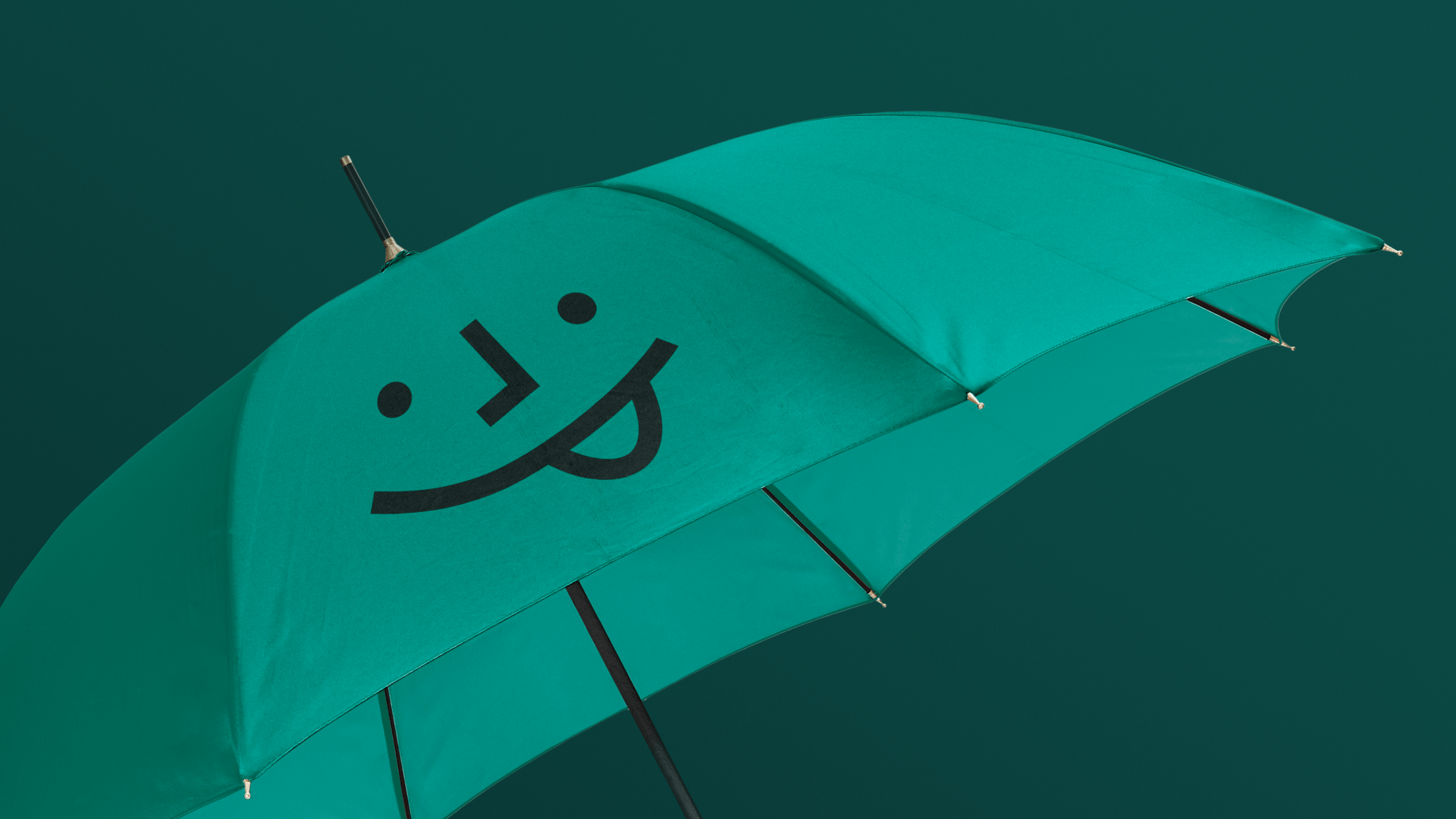
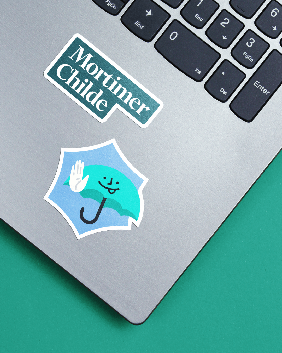
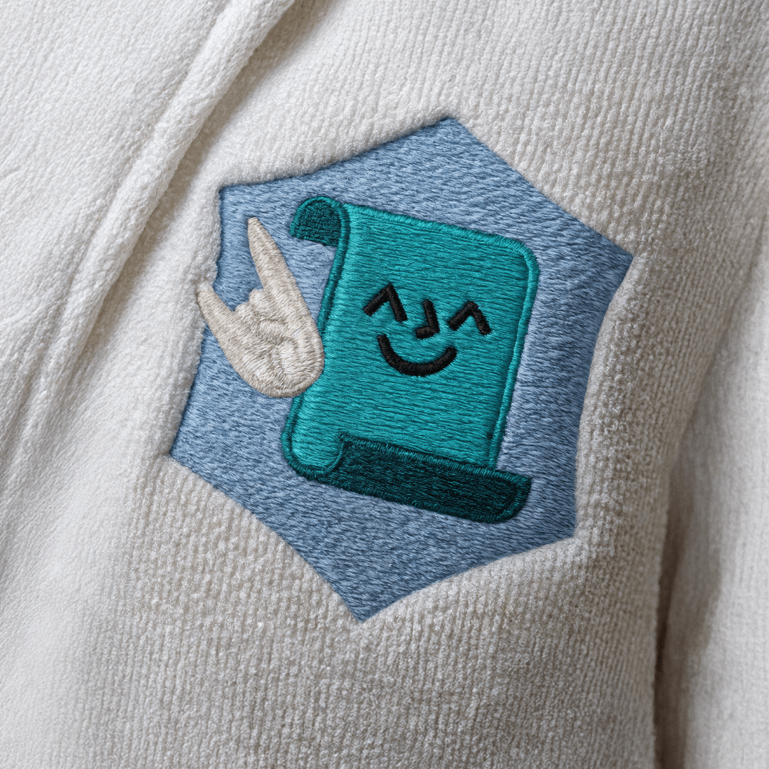
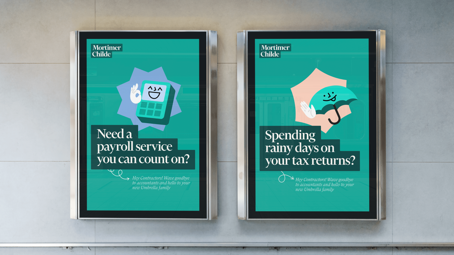
Building on the strategic foundations, we explored how the brand could express its personality visually. Early workshop exercises revealed a strong attraction to playful, behind-the-scenes imagery and character-driven storytelling. This inspired a visual system anchored in three illustrative guides, a calculator, an umbrella and a payroll scroll. They acted as friendly navigators through an otherwise complex subject.
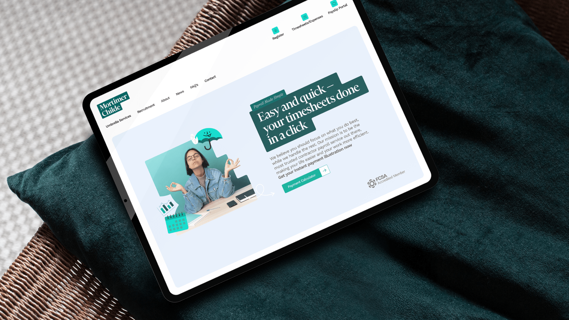
We also identified a stepped structure in the original logo thinking, a simple metaphor for progress and clarity. This evolved into a new, fluid stepped wordmark crafted using Financier Display by Klim Type Foundry, originally drawn for the redesign of the Financial Times. Paired with LL Bradford by Lineto, the typography created a balance of authority, warmth and subtle eccentricity.
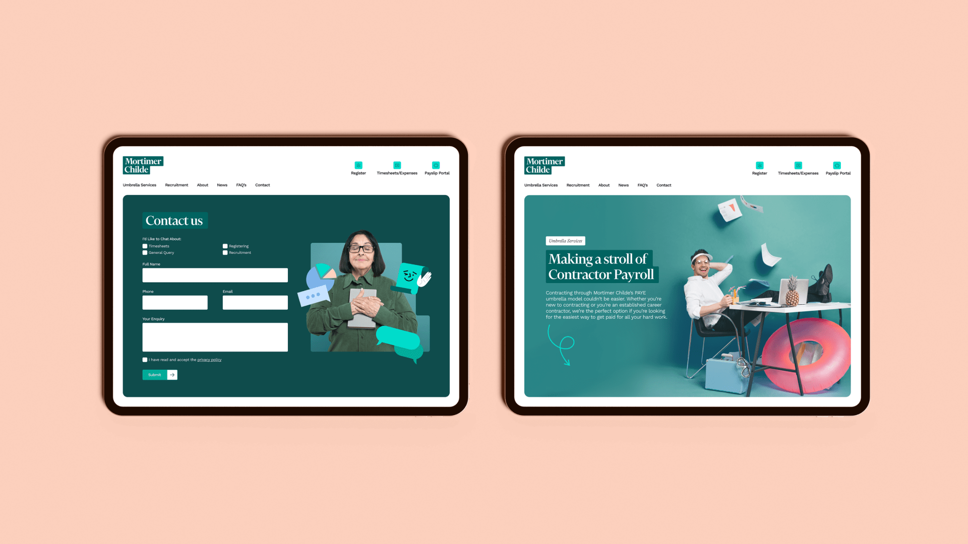
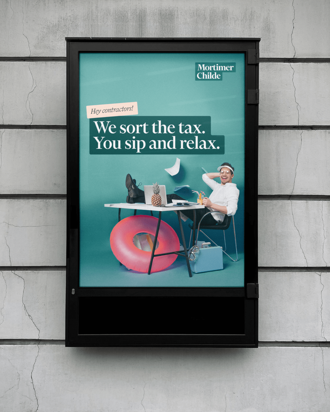
The brand expression extended through a bespoke illustration style that revealed the inner workings of payroll with humour and character, complemented by tongue-in-cheek photography of people visibly relaxed at work, reinforcing the promise of freedom, ease and peace of mind. A finance-inspired palette of deep greens added confidence and familiarity, while the stepped motif informed layout, framing devices and motion.
To ensure the brand could live confidently beyond launch, we rolled it out into a flexible digital ecosystem, including a modular, easy-to-maintain WordPress website, along with supporting assets such as email templates, sales collateral, presentations and internal materials, ensuring consistency across every touchpoint.
03
Shine
Since the launch of their new website and integration of the new Brand identity, Mortimer Childe has strengthened its market presence as a trusted, approachable umbrella company. Contractors consistently praise professionalism, responsiveness and peace of mind, reinforcing the clarity, reliability and personality of the new brand. External recognition, including being awarded “Best Small Umbrella Company” at The Contracting Awards 2025 and accreditation from the Diligence Hub and with the FCSA, highlights the company’s credibility and commitment to compliance. Together, these achievements show the rebrand has reinforced trust, added differentiation, and positioned Mortimer Childe for continued growth and confidence in a competitive market.